This is an educational project with an imaginary company and people. It is not related in any way to Apple Originals' Ted Lasso TV series.


By conducting interviews I tried to understand users’ needs. Primary user group identified through research was busy people living stressful life. This research confirmed initial hypothesis that these people have little time for making appointment to a psychologist. On the other hand there are more and more user who likes to book online.

I'm busy so I have little time for searching and making appointment to a psychologist.
I could select a date for appointment easier when I can see all the options.

I don't like to call somebody to book something I need. It is much more easier to do it online. When there is no option to do so I'll leave.
She is a busy business woman who feels stressed sometimes. Then she needs support and don't want to spend much time with makin an appointment to a psychologist.
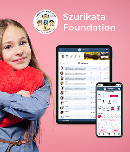
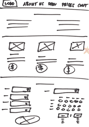
Mapping Kimi’s user journey revealed how helpful it would be for users to use the booking website.
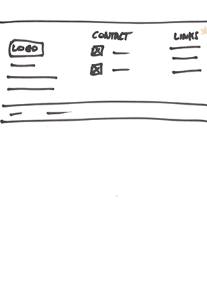
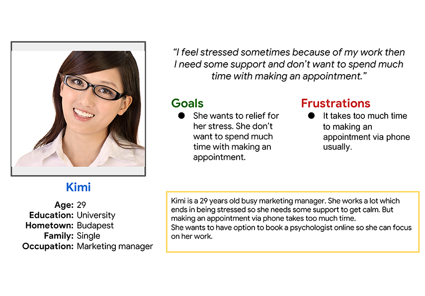
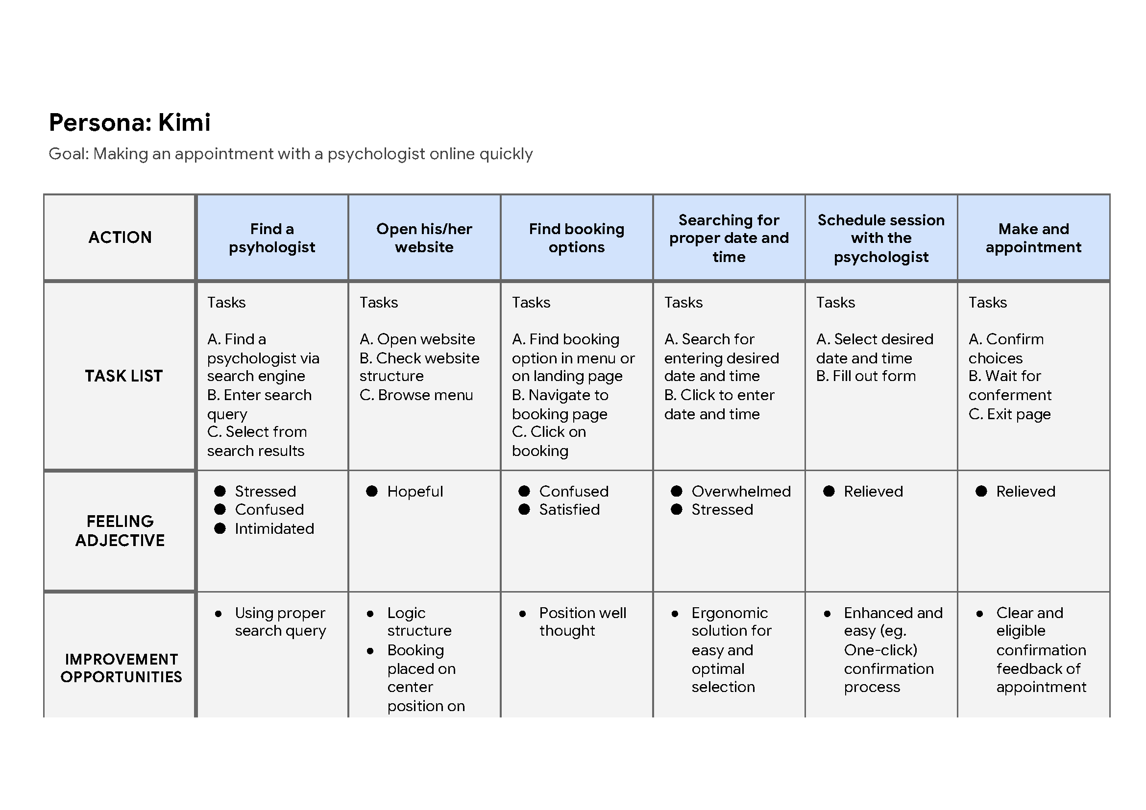
Drafting iterations of each screen of the app on paper ensured that the digital version of wireframes address user pain points.To find psychologist to make an appointment quickly. To help users to book easily online.

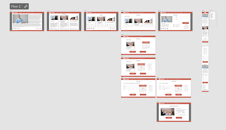
A low-fidelitiy prototype was created using the completed set of digital wireframes. The primary user flow was built representing the complete matching process and chating after connection was established. So this prototype could be used in a usability study.
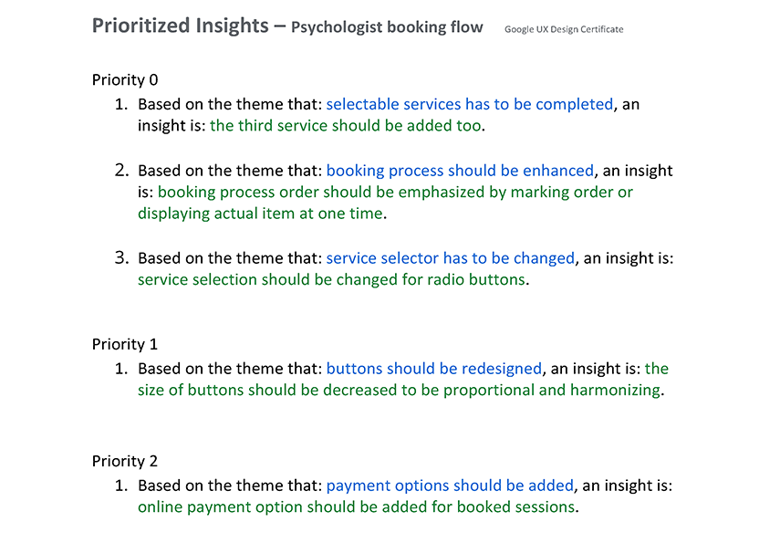
Usability studies were conducted. Insights from the first study resulted in a change of functional solutions and design.


The feedbacks of the usability studies resulted that service selector should be completed. So I created service cards.
I think this is the easiest and most clear way to represent services.

Early design didn’t represented process order properly as emerged in usability study. So I redesigned booking process so that next step is emphasized and/or other function are disabled or hidden.


The name of the client inspired me at the first sight to design a logo to this theme.
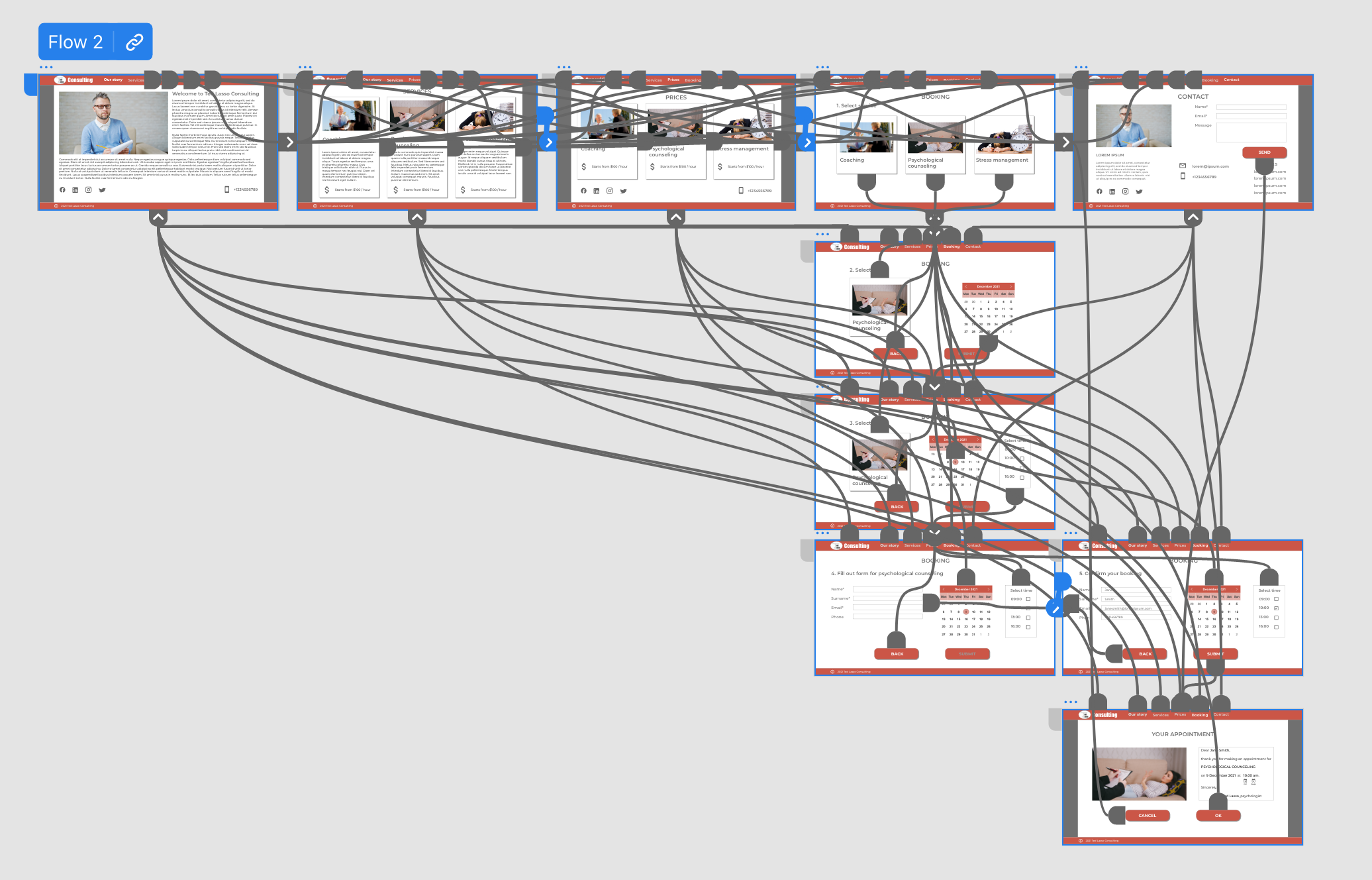
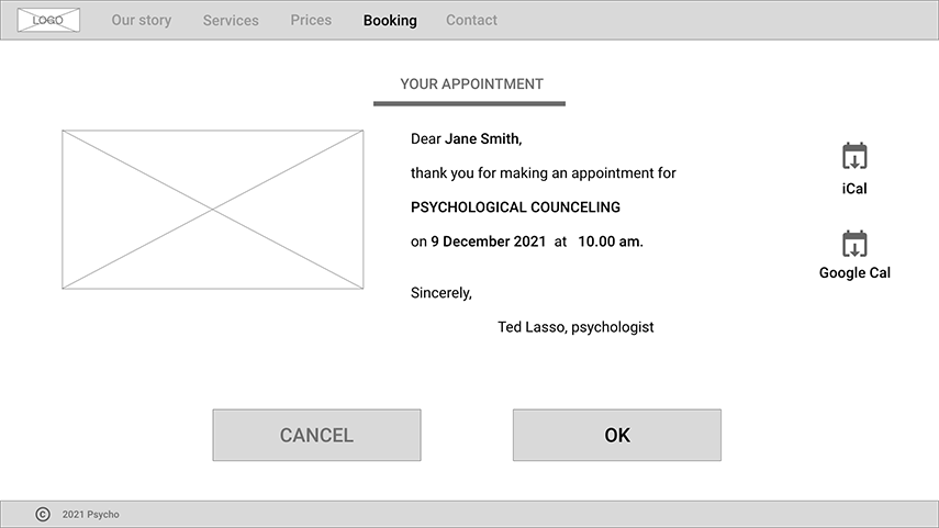
The final high-fidelity prototype presented improved user flows. It also met user needs for making an appointment to a psyhologist online and quickly and the selection is easier because of the visual support.